A full UX research-to-prototype redesign of Wikipedia's mobile interface — three user interviews, a structured survey, low-fidelity wireframing, four-user prototype testing, and a high-fidelity mobile prototype across five redesigned sections.
Wikipedia is where most research begins — a first stop for background knowledge, a quick reference mid-conversation, a fallback when other sources fail. Despite its scale and reach, its mobile experience hasn't kept pace with how people consume information: scanning rather than reading, jumping between sections, expecting summaries before committing to depth.
For DSGN 2570 (Design for Usability) at Penn, a complete UX research-to-prototype redesign of Wikipedia's mobile interface was undertaken. The process followed a rigorous human-centered design cycle: structured user interviews, a quantitative survey, synthesis into insight statements and How Might We questions, low-fidelity wireframing, prototype-based user testing with four participants, and a final high-fidelity prototype delivered across five redesigned sections — Home, Article, Search, Language, and an AI Chat feature.
Wikipedia's mobile app functions. But functioning is not the same as working well. Through initial walkthroughs and early conversations, several core friction points emerged — not isolated bugs, but structural mismatches between what the interface offers and how users actually move through information:
"I usually just Ctrl+F whatever I'm looking for. I don't actually read the article — I just scan for the part I need."
Before designing anything, time was spent understanding how real users interact with Wikipedia — not how they're expected to, but how they actually do. Three structured interviews were conducted across different academic backgrounds: a Wharton Finance student, a College Neuroscience student, and an Engineering Computer Science student.
The discussion guide covered six areas: general usage patterns, navigation behavior, specific pain points, mobile vs. desktop experience, comparison with competing tools, and improvement ideas. A supplementary survey captured quantitative data on usage frequency, session length, and feature awareness.
Key cross-cutting findings from the interview phase:
The findings were synthesized into six insight statements and six How Might We questions, each pointing toward a concrete redesign direction.
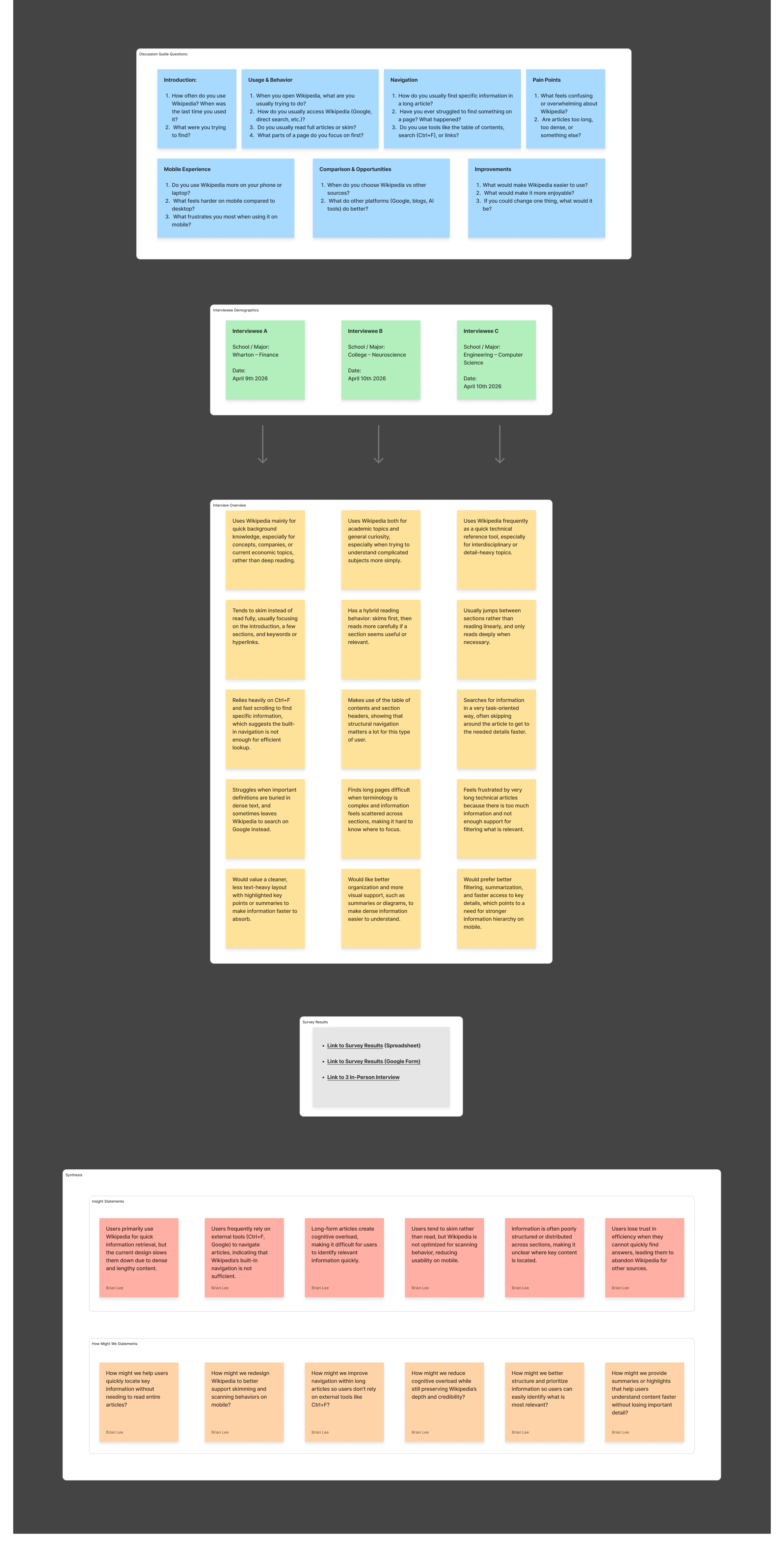
Research synthesis — discussion guide, interviewee demographics, findings, and insight statements with HMW questions
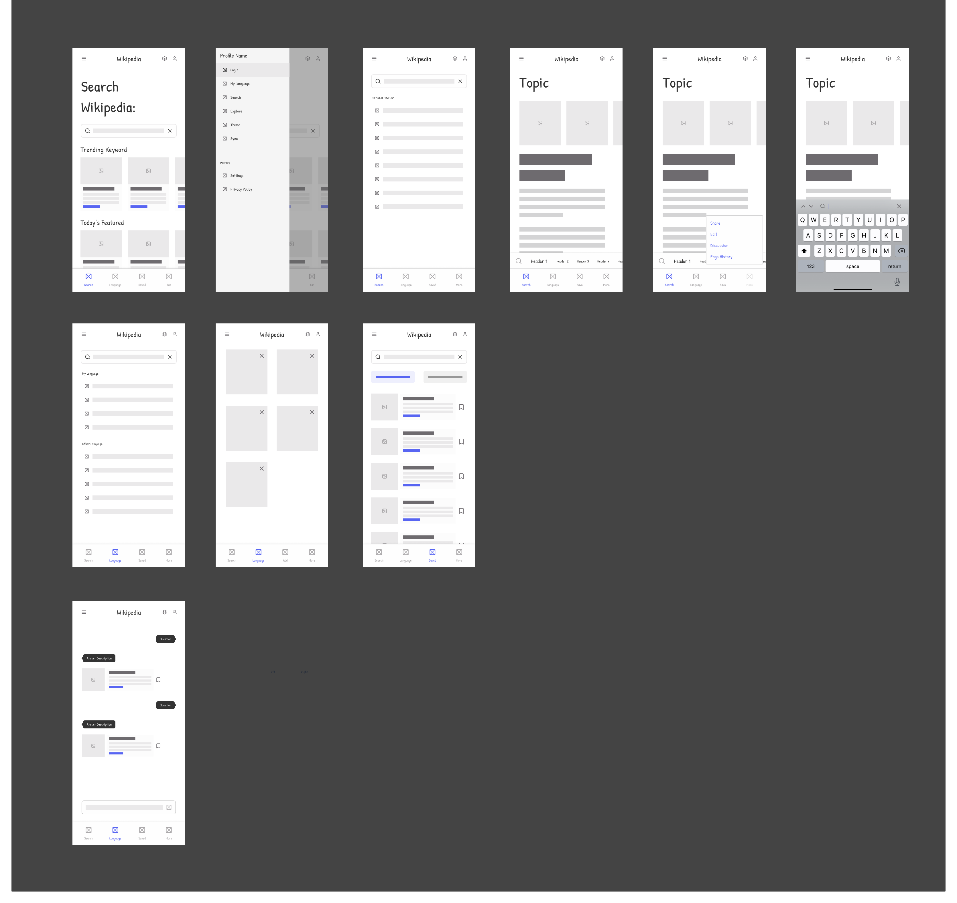
Low-fidelity wireframes were produced for nine screens, establishing the core information architecture and navigation model before any visual design began. The lo-fi phase focused on structural decisions: what lives on the home screen, how article navigation is restructured, how the action menu surfaces contextual options, and where language and AI chat fit within the existing tab structure.
Key structural decisions made at this stage:
Lo-fi wireframes — home, article, section navigation, language, search, and AI chat across 9 screens
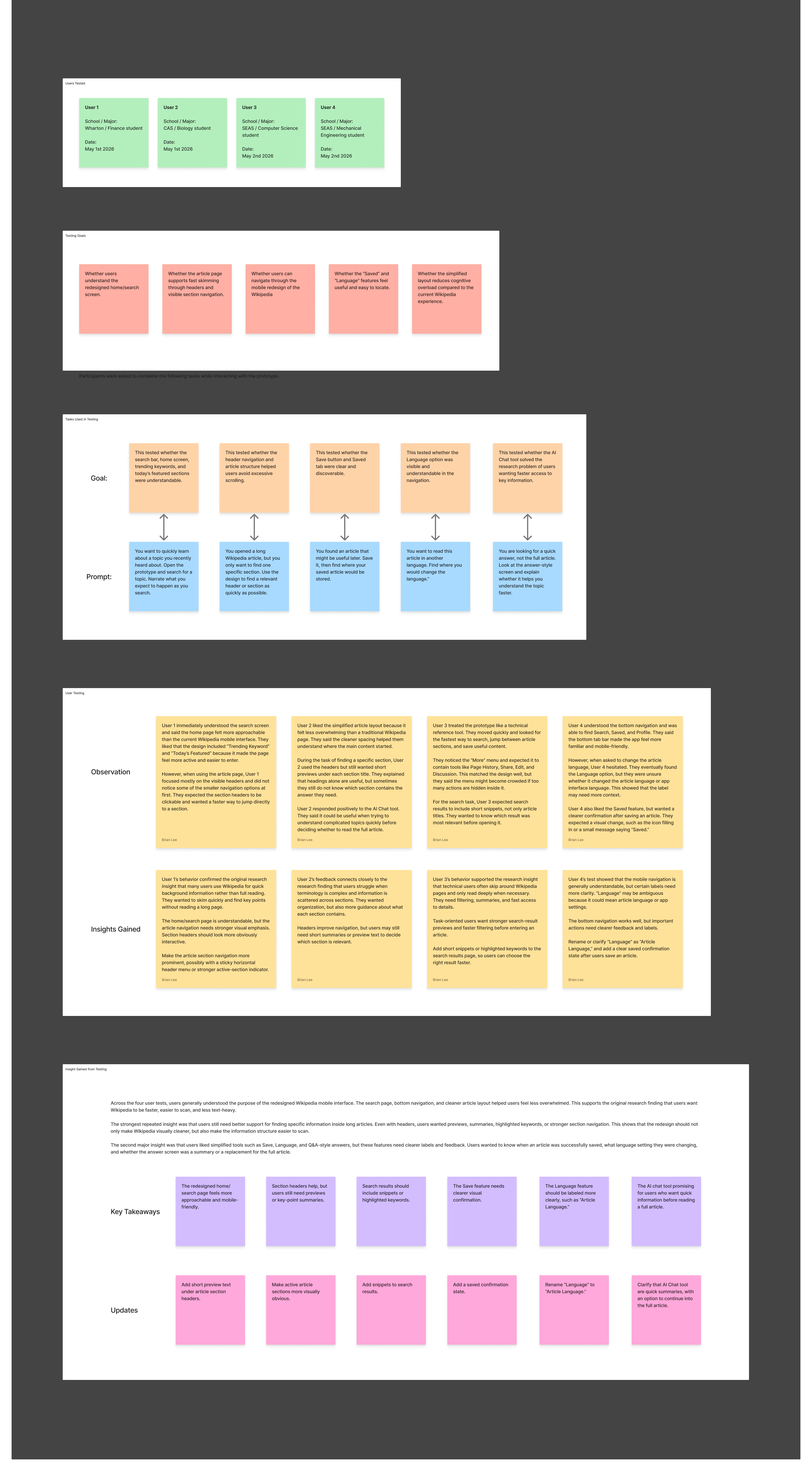
Mid-fidelity prototypes were tested with four participants from different Penn schools — Wharton Finance, CAS Biology, SEAS Computer Science, and SEAS Mechanical Engineering — each running through five task-based prompts while thinking aloud. Tasks were designed to test the specific structural decisions made in the lo-fi phase: home page comprehension, article navigation, section search, language switching, and AI Chat usability.
Key observations across all four sessions:
User testing — 4 participants, 5 task prompts, per-user observations, insights gained, and key takeaways driving final design updates
The high-fidelity prototype delivers a redesigned Wikipedia mobile experience across five core sections, each addressing a specific failure identified in research. The visual language stays close to Wikipedia's established identity — clean typography, minimal chrome — while restructuring the information hierarchy around how people actually scan and navigate.
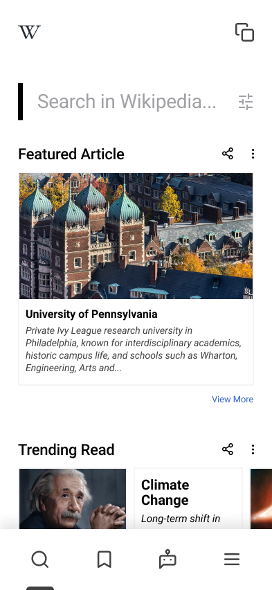
Home — search bar, featured article, and trending read surfaced on entry
Splash — minimal branded entry point before the home feed loads
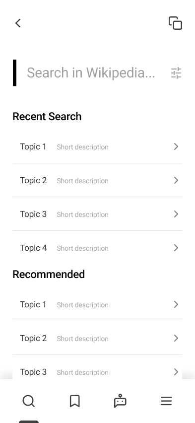
Search — recent searches and recommended topics surfaced before typing
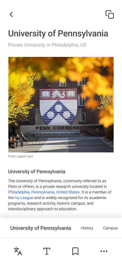
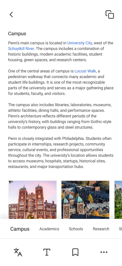
Article — hero image with article text and persistent section strip at the bottom
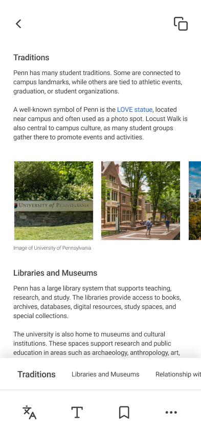
Section strip — scrollable header tabs let users jump directly to any section
Deep scroll — section strip maintains navigation context as the user reads further
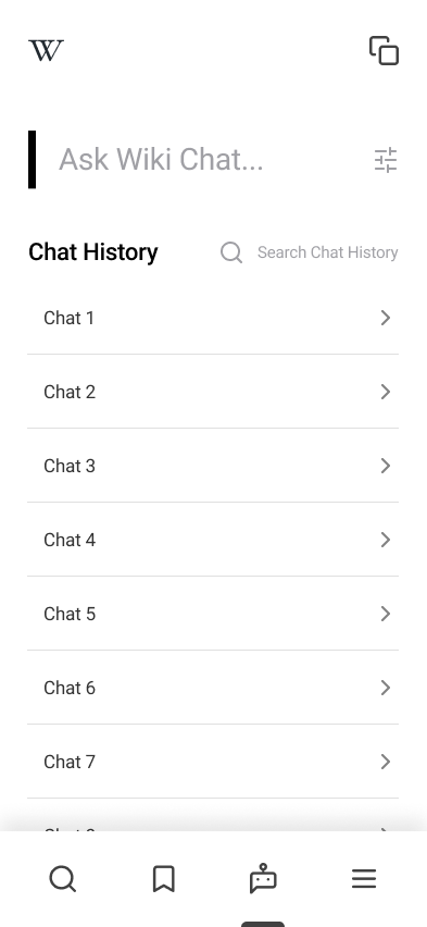
Chat home — past chat history with search, and a quick entry to ask a new question
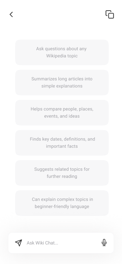
Chat capabilities — six capability cards set user expectations before the first message
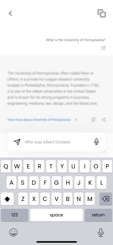
Chat in use — AI answer with a link back to the full article, follow-up question in progress
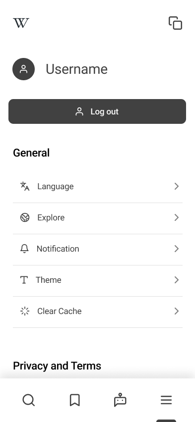
More — user profile, language, theme, notifications, and cache all in one place
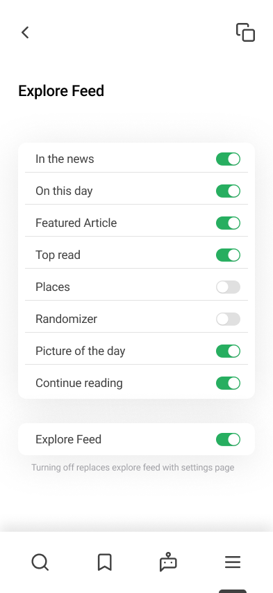
Explore Feed — per-section toggles give users control over what appears on the home screen
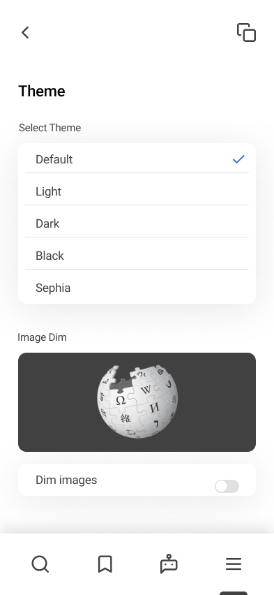
Theme — Default, Light, Dark, Black, and Sepia modes with live image dim preview
The most revealing part of this project was how thoroughly users had adapted to Wikipedia's shortcomings. Ctrl+F for in-page search, a tab open for each related article, Google as the real search layer — these weren't complaints; they were workflows. Users had built systems around the interface's failures so completely that some didn't initially identify them as problems at all.
Surfacing those workarounds as design signals — not just as feedback — was the core methodological challenge. The interviews weren't useful because users said "this is broken." They were useful because of what users showed when asked to complete a task: where they paused, where they reached for something that wasn't there, where they fell back to a behavior the interface hadn't intended.
The AI Chat feature exposed the sharpest tension in the project: adding something new to a platform defined by not being biased or opinionated. Framing it as a summary tool rather than an answer engine — and linking every response back to source articles — was both a usability decision and a philosophical one. Wikipedia's credibility depends on citations and transparency; the chat had to preserve that contract.
The final prototype is a mobile-first redesign, not a feature addition. Most of what changed was not new — it was the same Wikipedia, reorganized around how people actually read.