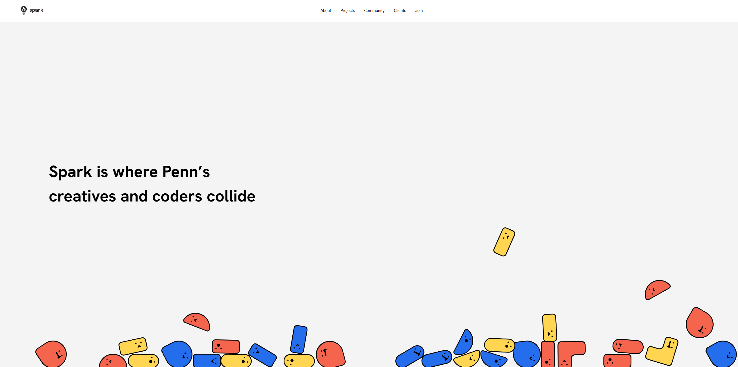
Leading the end-to-end redesign of Penn Spark's public website — from a stale Gatsby codebase to a modern Next.js platform with a cohesive design system and case-study driven experience.
Penn Spark is UPenn's technology consulting club, where students partner with organizations to build impactful software. As project lead for the website redesign, the work spanned both ends of the stack — leading a team through a Figma-first design process, then rebuilding the site from the ground up in code.
The existing site was built on Gatsby and hadn't been meaningfully updated in years. It suffered from inconsistent branding, outdated content, slow performance, and a codebase that was difficult for non-technical club members to maintain. The redesign was an opportunity to fix all of it simultaneously.
Penn Spark's public face — the first thing potential members, clients, and partner organizations see — was a site that didn't match the quality of work the club actually does. Several core issues needed addressing:
The process began with Figma — not code. Wireframes established the page structure and information hierarchy across the key pages (Home, About, Projects, Join, Contact). A component system was built alongside the wireframes, defining typography, spacing, color tokens, and reusable UI patterns like cards, navigation, and call-to-action blocks.
Once the high-fidelity designs were reviewed and approved by the team, development began on a Next.js + React stack. This choice was deliberate: Next.js offers better performance than Gatsby for a static marketing site, and React's component model maps directly to how the Figma designs were structured.
Tailwind CSS was used for styling — fast to write, easy to maintain, and it enforces consistency without requiring a custom design token system in code. Shared components (NavBar, ProjectCard, TeamMember, Footer) were built once and reused across every page.
Content for case studies was structured as data files, making it straightforward for future club members to add new projects without touching component code.
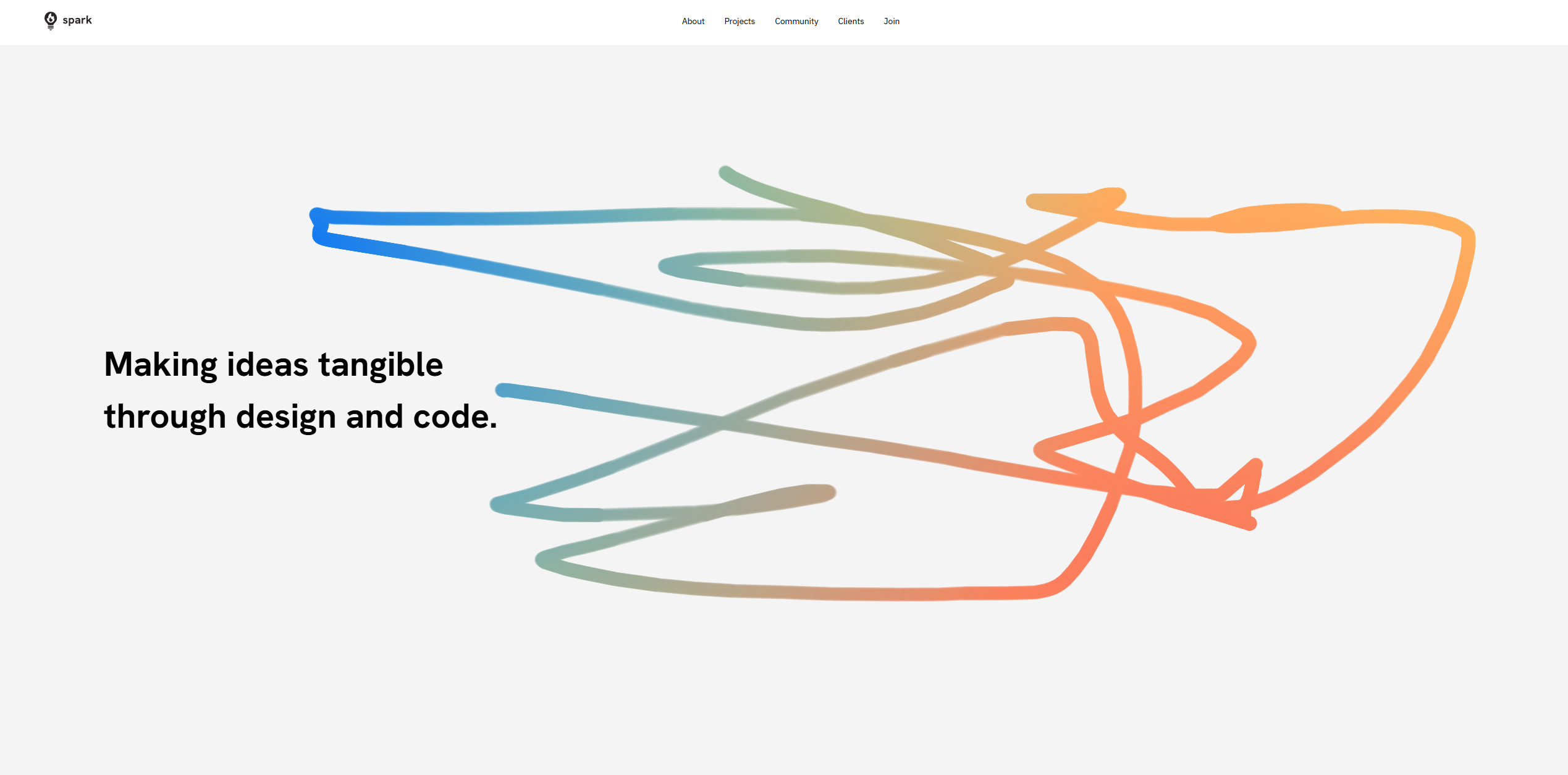
Each scroll section has its own visual language — abstract illustration for the design ethos
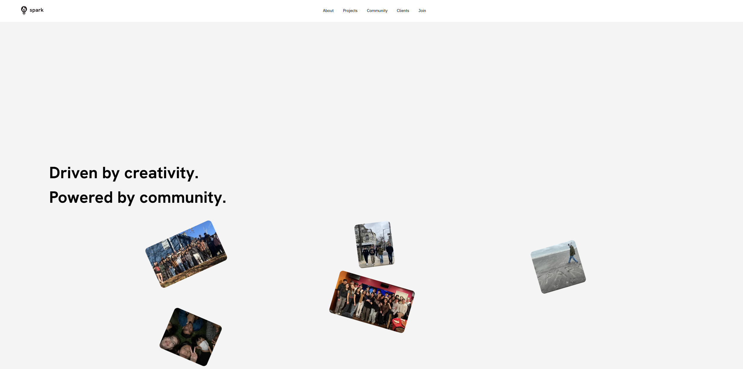
Community section — scattered polaroid layout showing real club events and members
The redesigned pennspark.org launched at the end of Fall 2025. Compared to the previous site, it loads significantly faster, has a consistent visual identity across all pages, and surfaces the club's project work through dedicated case study pages.
The structured content approach means future project leads can add new case studies, team members, and events by editing data files rather than modifying component code. The design system in Figma and the shared component library in code are both documented and handed off for ongoing use.
Leading this project end-to-end — from user research and wireframes through design system and final deployment — was one of the most complete product experiences in my work so far.
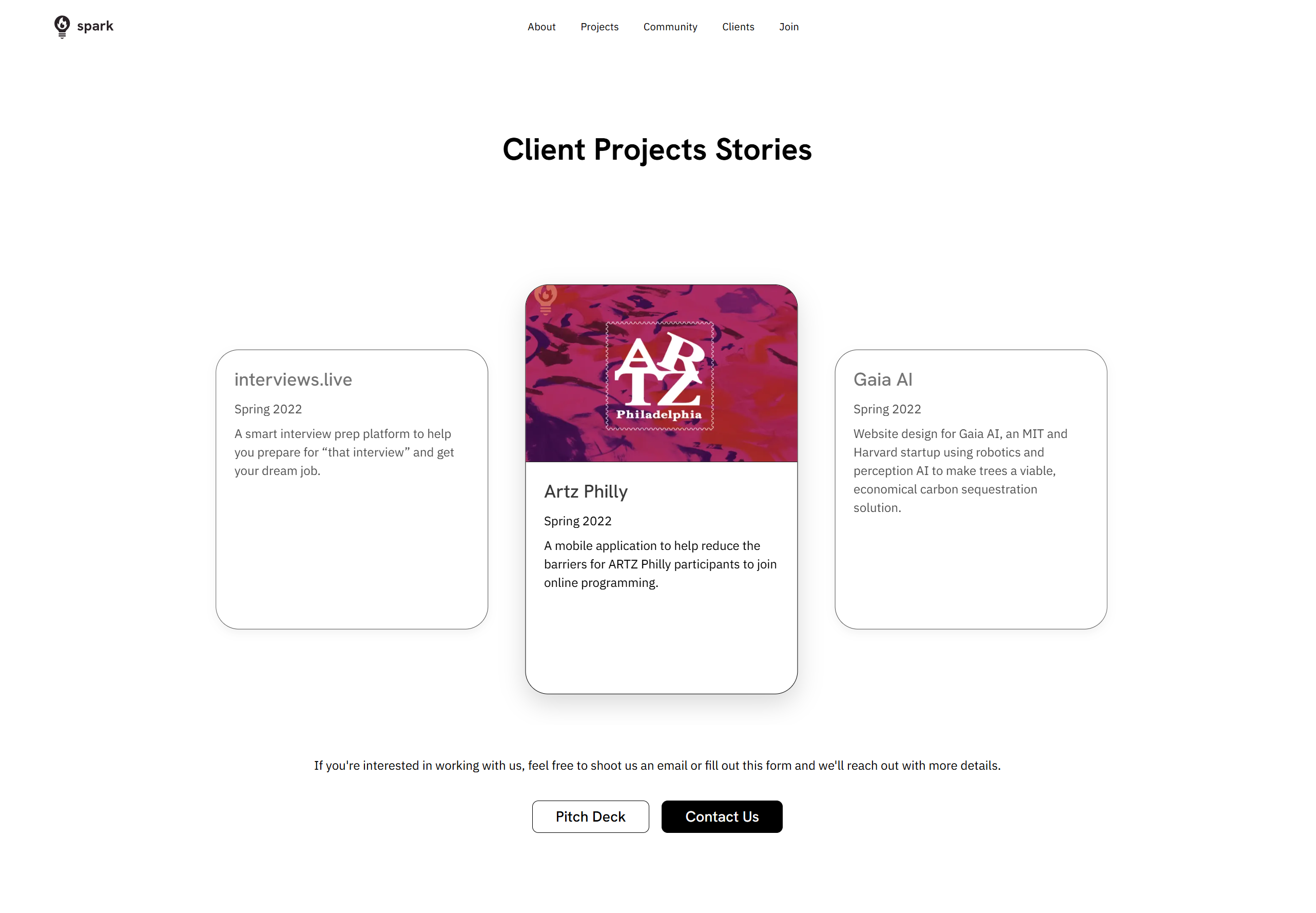
Client Projects Stories — the case study showcase that the old site was missing entirely
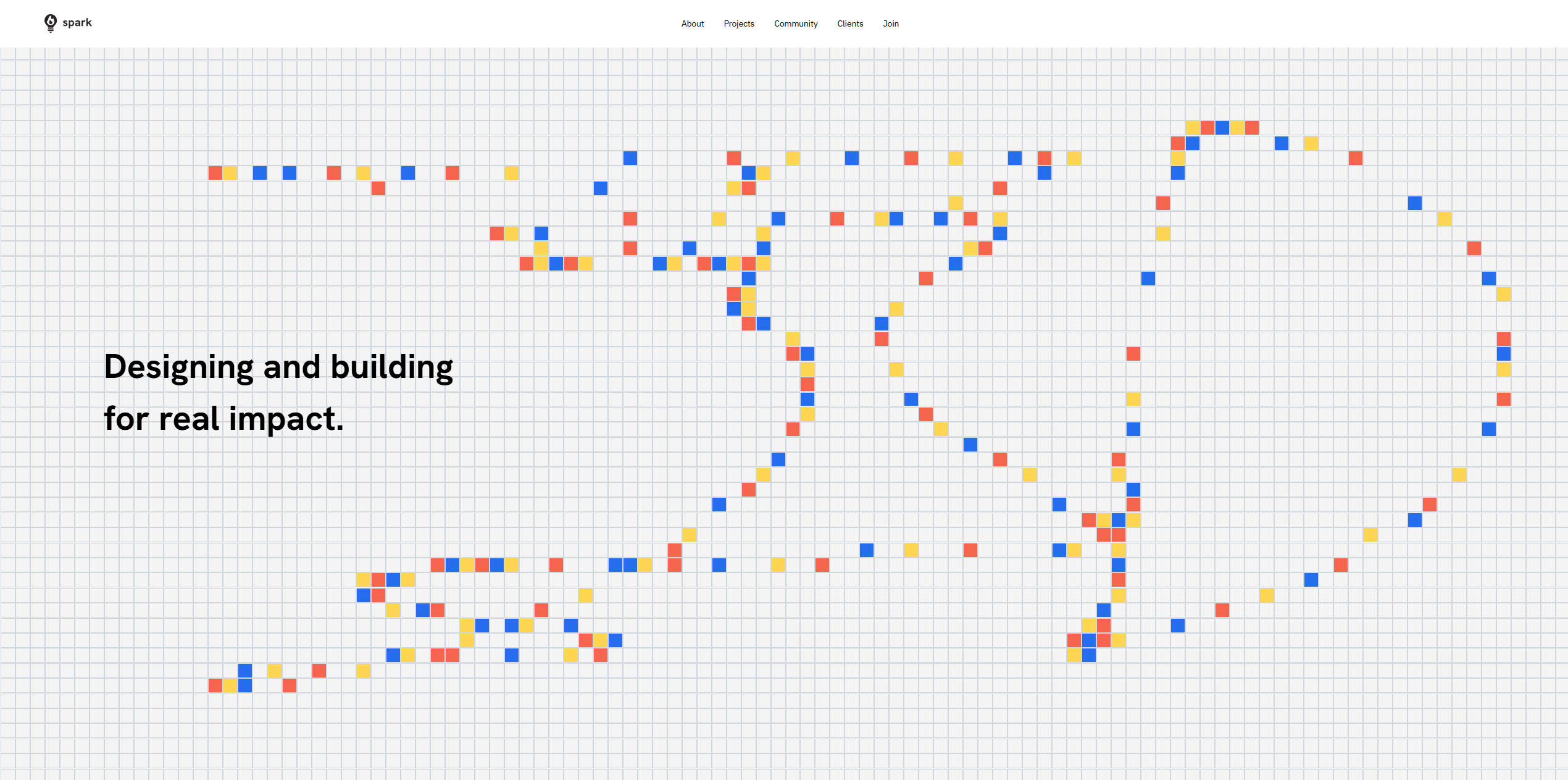
Pixel dot grid — custom interactive animation reinforcing the brand's creative identity
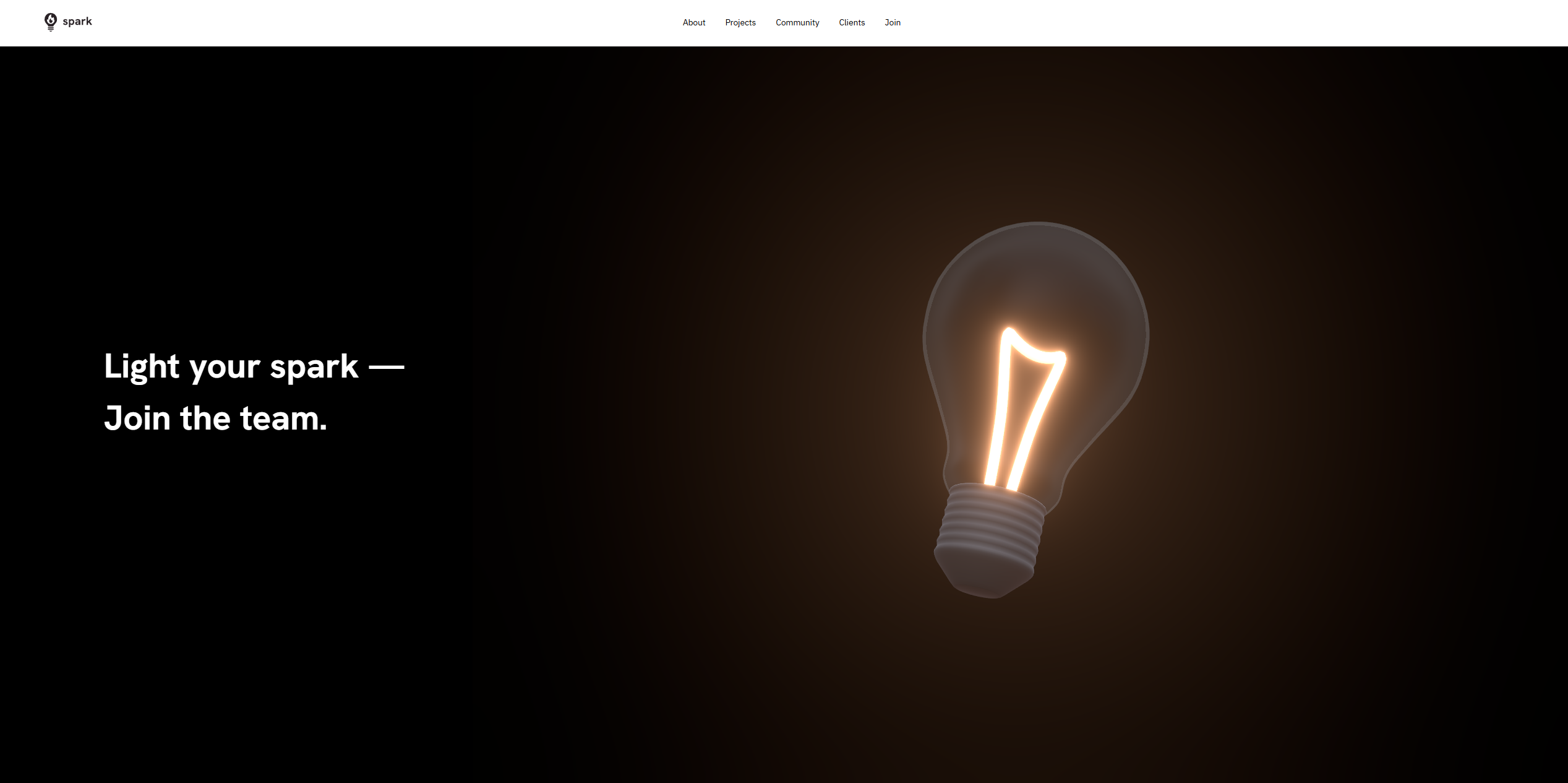
Join section — dramatic tonal shift, driving the recruitment CTA