Reimagining UPenn's course planning portal — from a fragmented, confusing experience into a clear, guided academic journey across four connected sections.
Path@Penn is the University of Pennsylvania's primary portal for course registration, schedule planning, and degree tracking — a tool every student relies on each semester. Despite its central role, the existing experience is plagued by a dense, fragmented interface that makes course planning harder than it needs to be, particularly for first-time users navigating registration for the first time.
This project was a self-directed effort: no client, no team, no brief. The goal was to take a platform students use out of necessity — not by choice — and redesign it into something genuinely useful, intuitive, and cohesive.
The core frustration with Path@Penn isn't a single broken feature — it's the cumulative friction of many small failures. Through informal conversations and personal experience, four recurring pain points emerged:
"I use like four different apps just to plan my schedule. Path@Penn is the last step — I don't actually use it to plan anything."
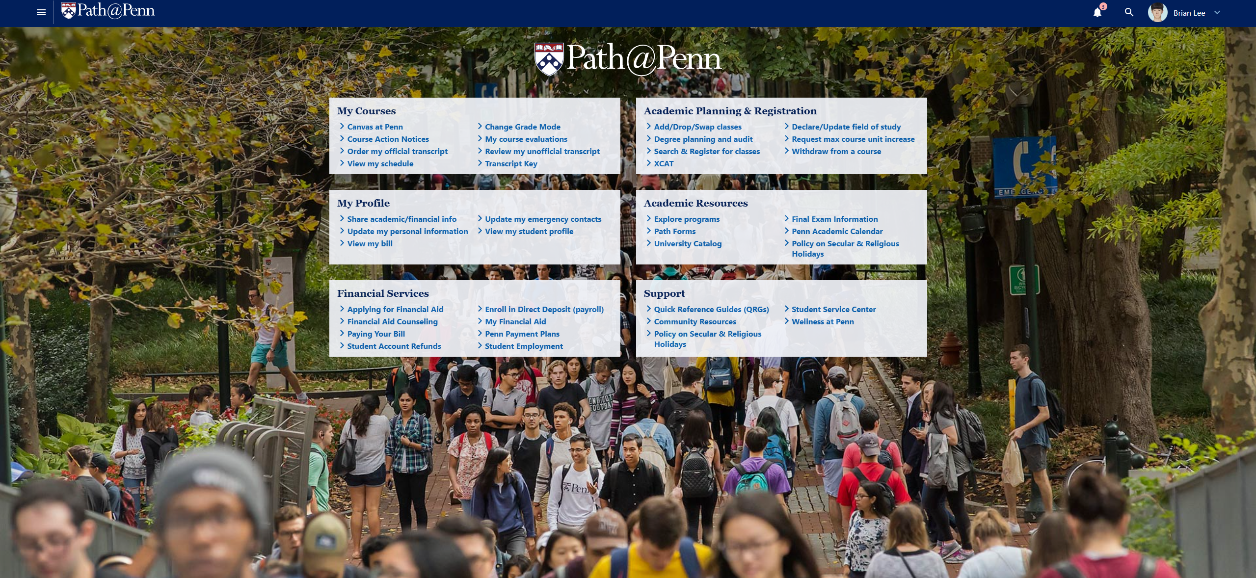
The existing Path@Penn home page — six category panels over a campus photo, no guided flow, no clear starting point
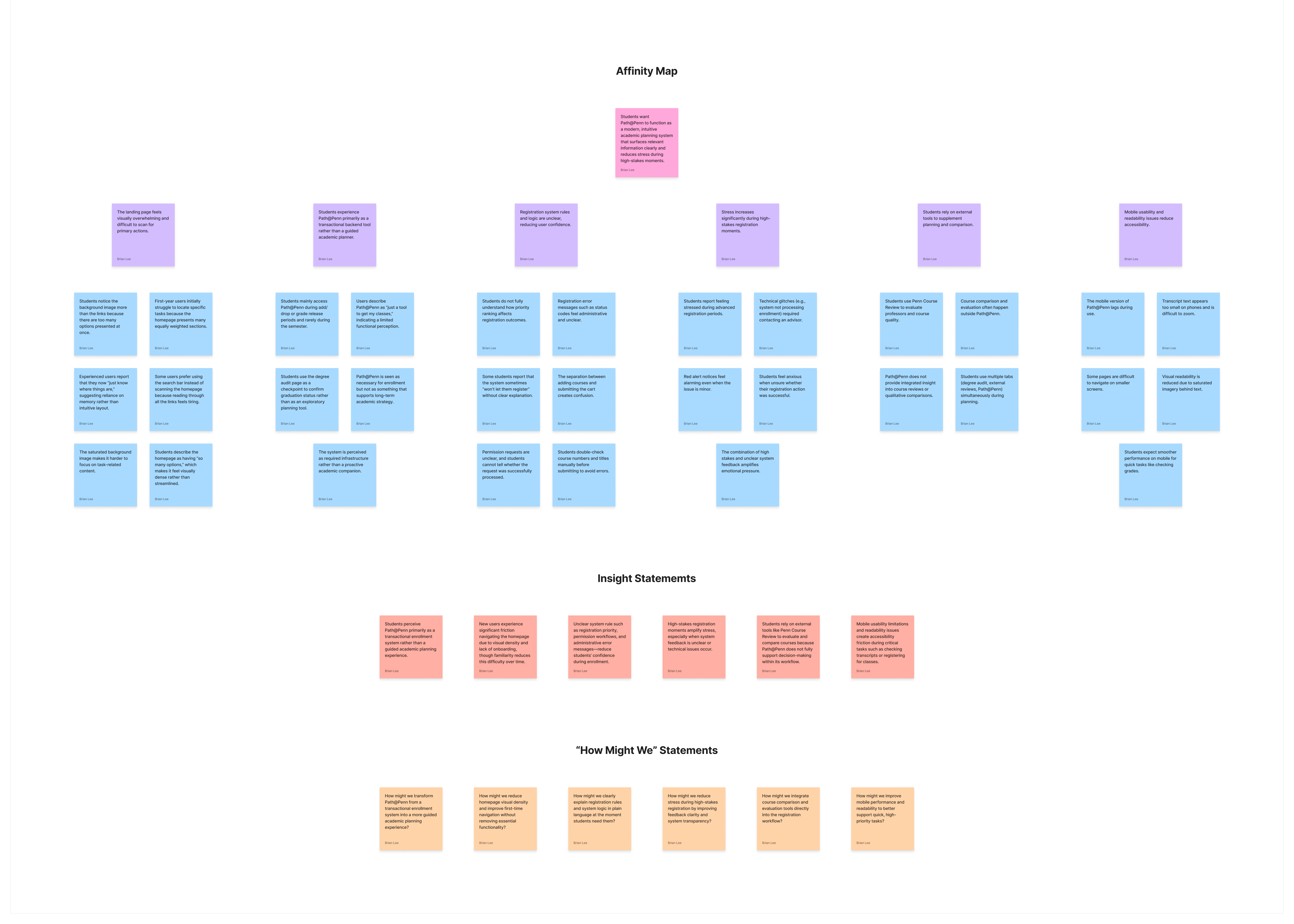
Before touching Figma, time was spent understanding how students actually use the platform — not how they're supposed to. This involved a mix of observational walkthroughs, informal interviews, and auditing the existing UI against established usability heuristics.
Key insights from the research phase:
These findings shaped a clear design direction: restructure the portal around the actual mental model students bring with them, not the backend database architecture it currently reflects.
User interviews — understanding how students actually navigate the portal and where they get stuck
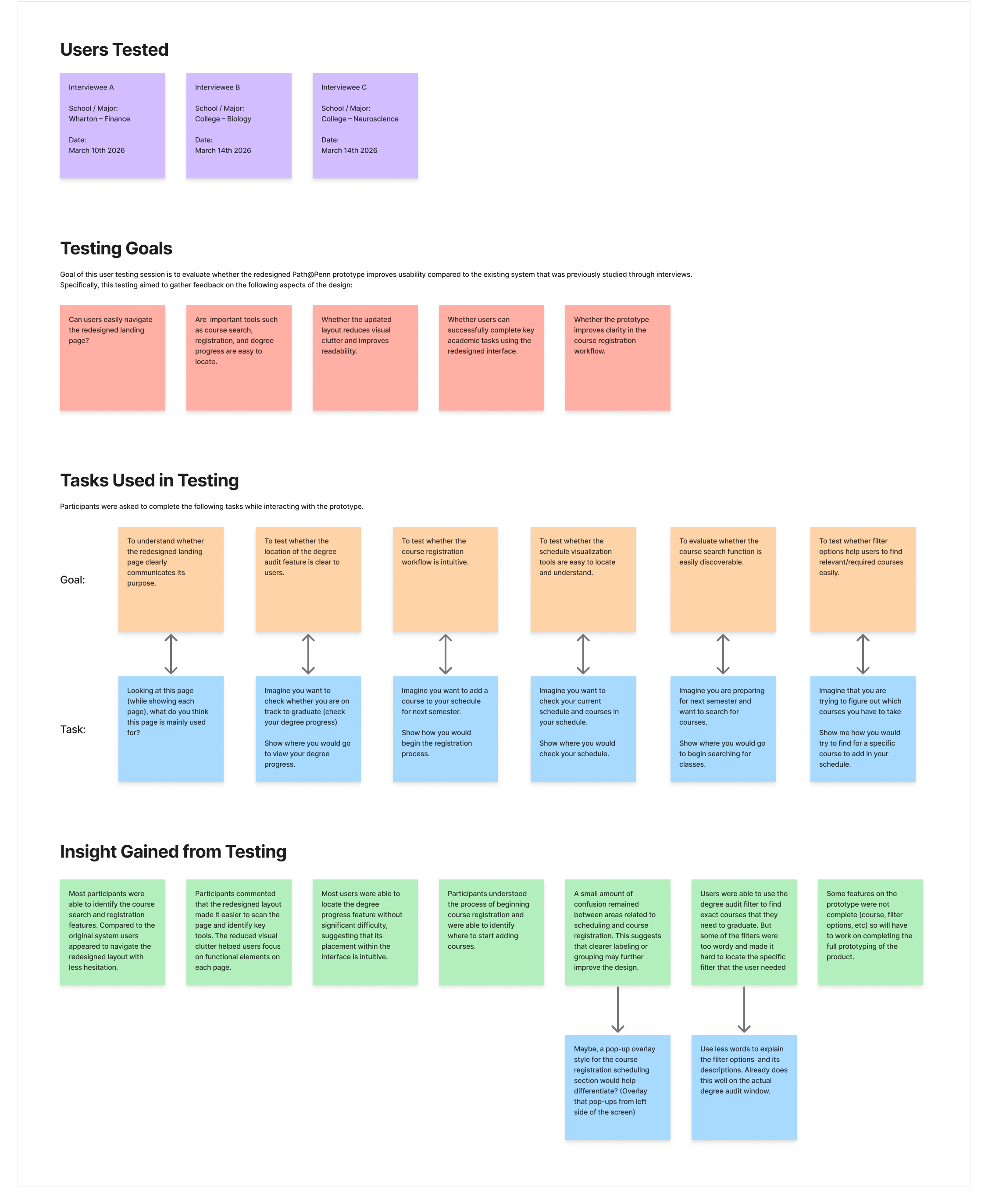
User testing — task-based sessions with think-aloud protocol to validate mid-fidelity wireframes
The design process followed a deliberate progression: define the structure first, then refine the visual execution.
Early sketches and lo-fi wireframes focused on information architecture — deciding what lives where, how sections connect, and how navigation should signal progress. Multiple layout concepts were explored before settling on a four-section structure that mirrors the way students think about planning:
Mid-fidelity prototypes were tested informally with peers — asking them to complete specific tasks (find a course, add it to their schedule, check their degree progress) while thinking aloud. Feedback was used to simplify the navigation, improve the visual hierarchy on the Course and Schedule pages, and make the registration confirmation state far more explicit.
High-fidelity designs were built in Figma with a consistent component system: shared type styles, color tokens, and reusable UI components that kept the four sections visually cohesive despite their different content structures.
Dashboard — personalized home with credits, current courses, and quick actions
Course — search with cart sidebar and inline course cards
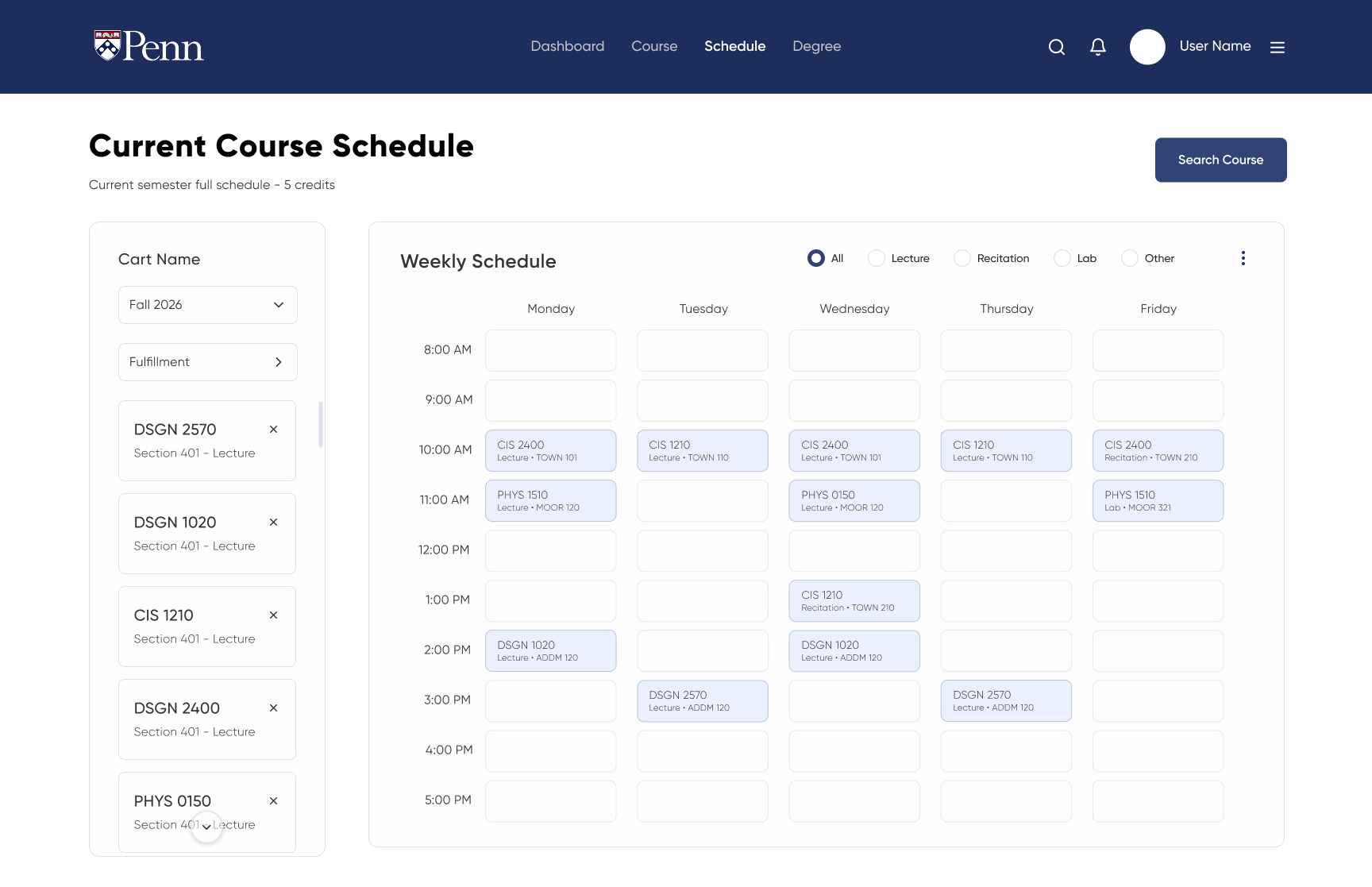
Schedule — visual weekly view with live conflict detection
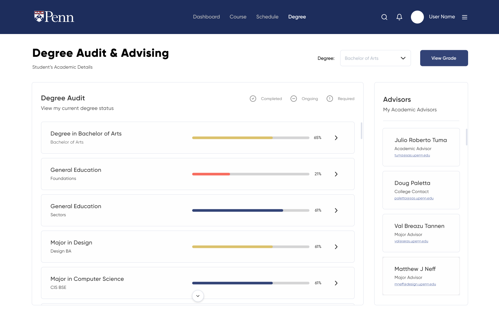
Degree — audit and advising with progress bars and advisor contacts
The final prototype delivers a fundamentally different experience from the existing portal — not by adding features, but by reorganizing what already exists into a structure that actually matches how students plan.
The redesigned portal reduces the number of clicks to complete core tasks, surfaces registration feedback directly at the point of action, and gives students a single, trustworthy place to understand where they stand toward graduation — without needing a separate app.
This project deepened an interest in systems-level design: not just making individual screens look good, but making the connections between screens — and between features — feel intentional and clear.
Submit Registration — explicit confirmation state with schedule preview before finalising